UX Research · UX Design · Feb 2023
Consolidating scattered metrics into a unified hub — making data accessible without a spreadsheet or an IT ticket.
Challenge
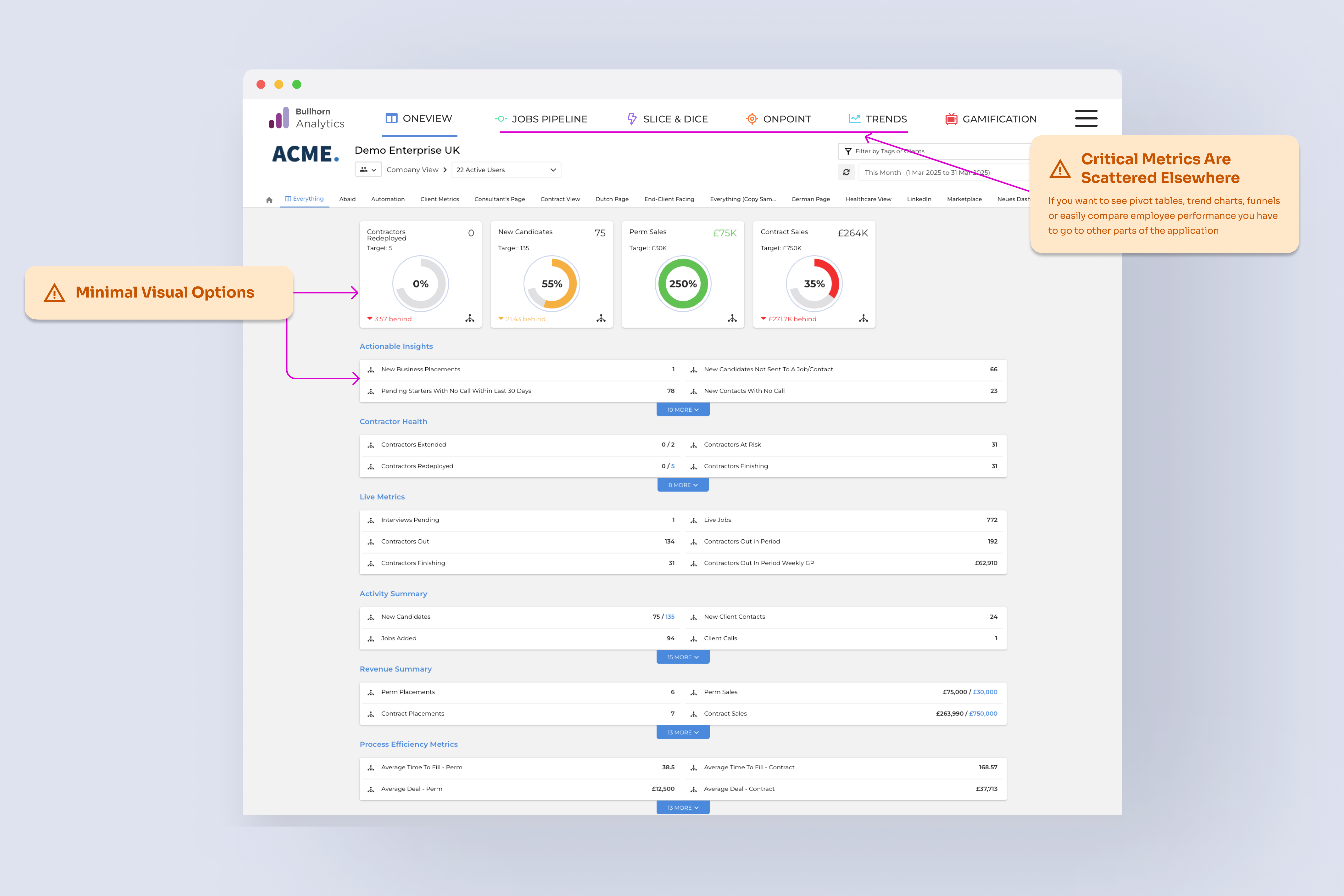
Recruiters and hiring managers were working with data spread across the product — no single place to see what mattered. Building a custom report meant wrestling a configuration tool so complex that most people had given up on it entirely, defaulting to spreadsheets or filing IT requests just to get basic visibility.
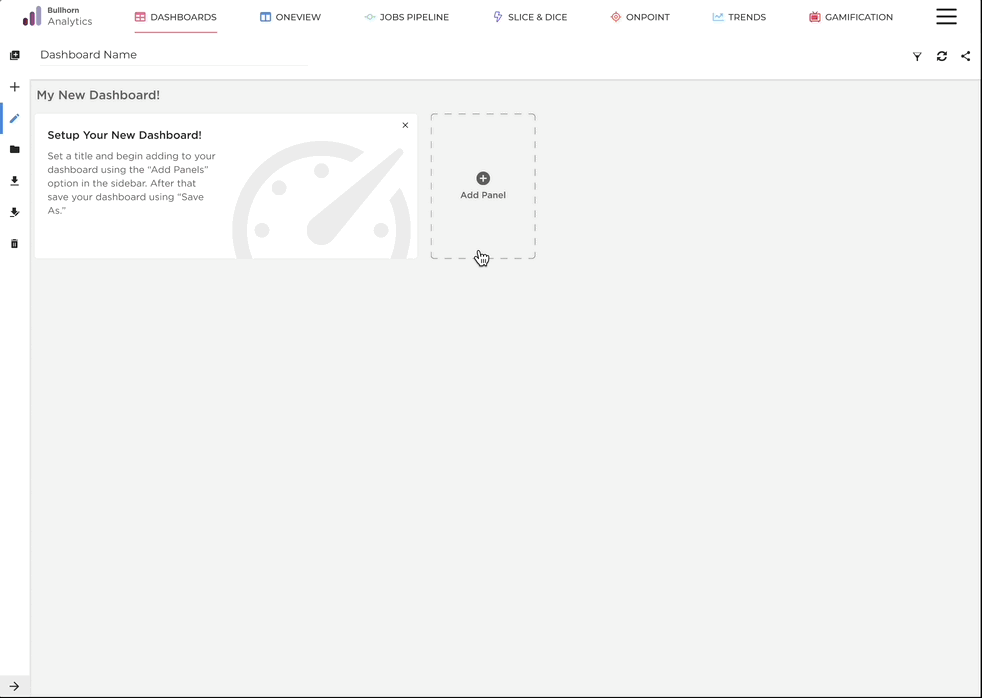
The goal was to consolidate the most-used metrics into a unified dashboard while dramatically simplifying the customization experience — so decision-makers could access insights without switching tools or asking for help.
Users were resorting to spreadsheets and IT support just to build reports the product should have made obvious.
Research
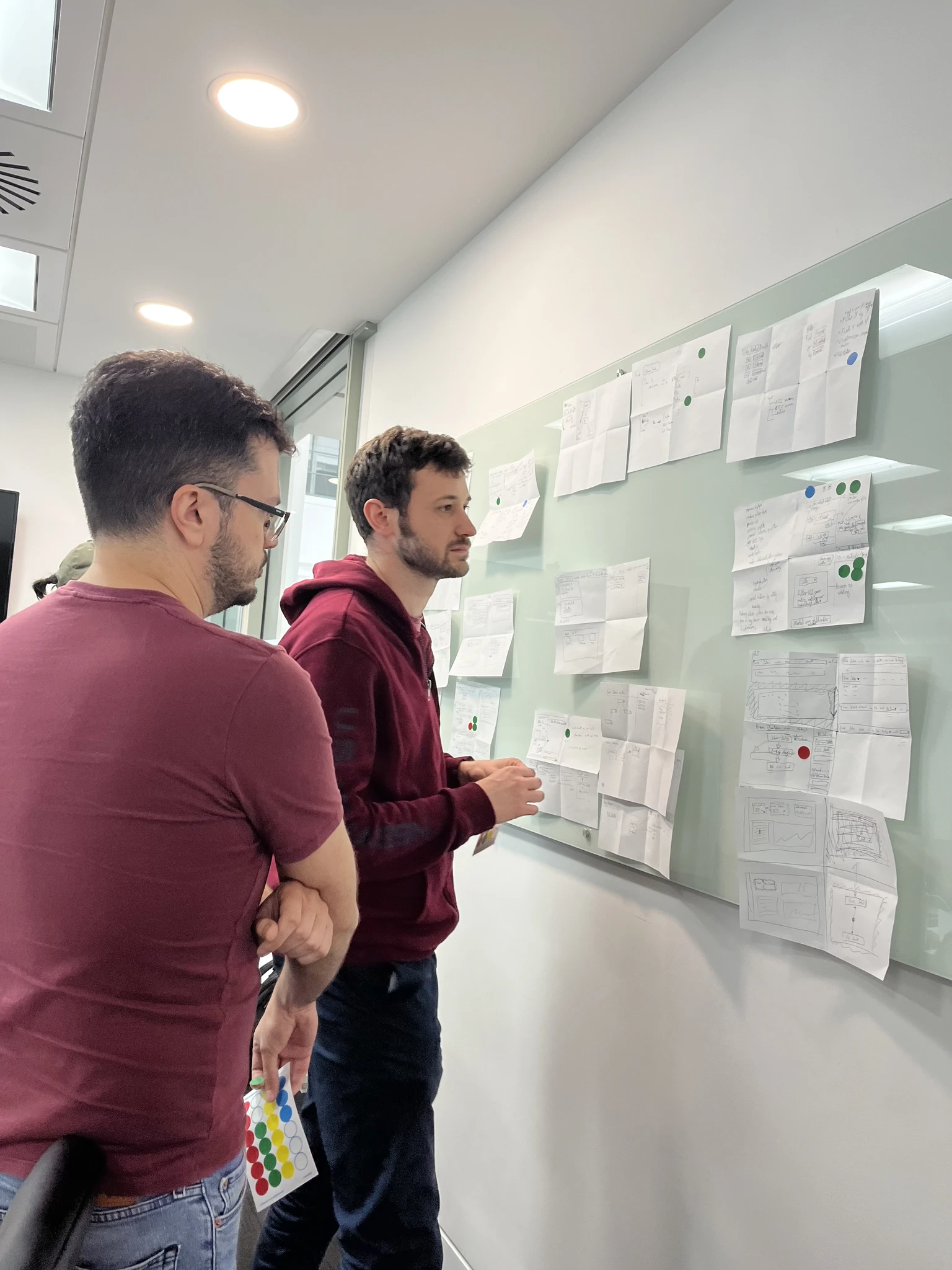
I ran a Crazy 8s ideation session with the team — skepticism in the room at first, but rapid iteration exposed angles no one had considered upfront. Before generating solutions, I wanted to be sure the problem space was fully mapped. What emerged from the research was surprisingly consistent: users didn't need more data, they needed less friction getting to the data they already cared about.
01
Managers found the report creation flow too complex to navigate. Rather than persist, they exported to spreadsheets — adding manual work to get information they should have had in a click.
02
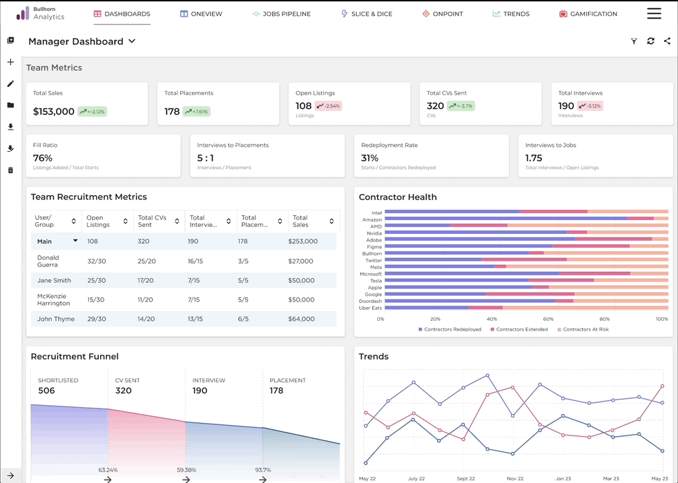
The ability to compare performance across team members wasn't a nice-to-have — it was a workflow blocker. Users were approximating it with workarounds because the product didn't support it natively.
03
4 out of 5 hiring managers specifically requested a recruitment funnel view — a way to spot bottlenecks immediately without digging through multiple reports to assemble a picture themselves.
04
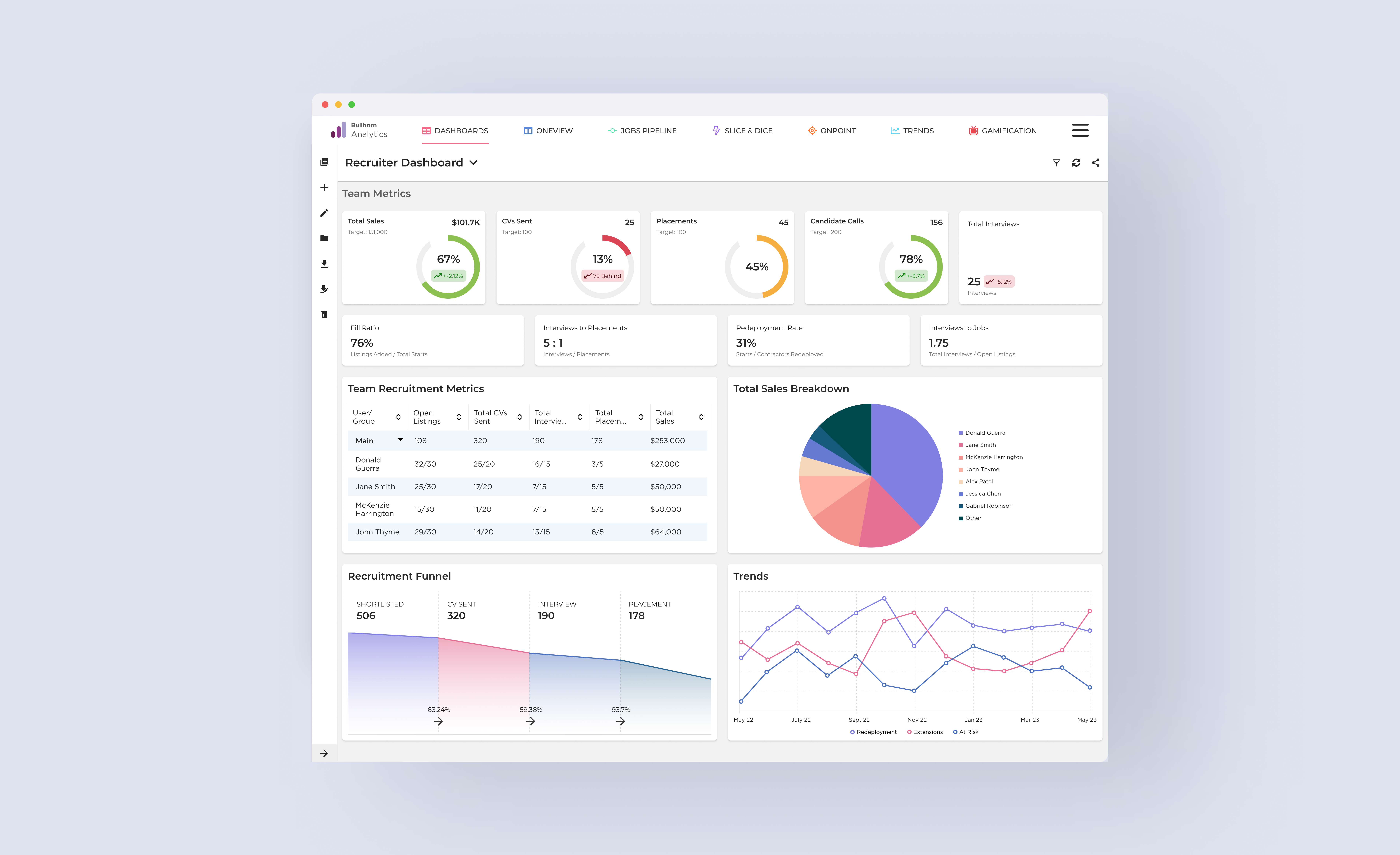
Users struggled to locate the business metrics they checked most often. Important numbers weren't surfaced by default — they required navigating to the right report before they were even visible.
Design
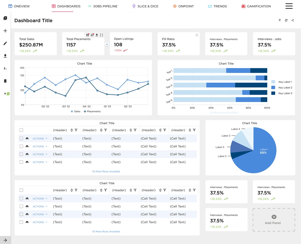
The central design decision was to make the default experience useful out of the box — not a blank canvas that required setup before it gave you anything back. The most-used metrics across the platform were identified and surfaced as the starting point, with customization available when users wanted it rather than demanded upfront.
Core mechanism
A guided widget creation wizard let users build exactly the view they needed — step by step, no technical knowledge required. An expandable sidebar kept navigation clean without sacrificing access. The dashboard shared well and could be set as a user default, removing the repeat setup that had pushed people toward spreadsheets.
User testing revealed a few additional requests — custom color options, executive report templates, integration with other product areas — but the core experience validated cleanly. Only minor refinements came out of the 8 customer sessions, which meant the direction was right.
Execution
What this shows
A step-by-step widget creation wizard — each decision guided in sequence, no blank-state configuration required.
Why it matters
The old report builder was so complex that most users had abandoned it entirely, defaulting to spreadsheets instead.
The result
Users who hadn't touched the report builder in months could create custom widgets in under a minute — no IT ticket required.
What this shows
An expandable sidebar that collapses to maximise dashboard space and opens on demand for navigation.
Why it matters
In the original design, navigation and content competed for the same space — users had to choose between seeing their data and getting around the product.
The result
Full dashboard visibility by default, with navigation always one click away — no layout trade-off required.
Results
83%
Stickiness Rate
Users who tried the dashboard came back — the clearest signal that it solved a real, recurring need.
60%
Account Adoption
6 in 10 accounts activated the dashboard, significantly outpacing internal adoption targets for the feature.
6k
Users in First Month
Strong out-of-the-gate engagement, with thousands of users adopting the dashboard within the first month of launch.
Reflection
This was my first project that involved significant scope reduction mid-stream. Key stakeholders departed during the work, and the roadmap shifted around us. It would have been easy to let the momentum stall along with the organizational change.
What I learned was that user value doesn't disappear when the org chart changes. The problem was still real, the research was still valid, and the direction was still right. Adapting meant narrowing scope without losing the core insight — delivering something that worked well for fewer features rather than something that worked poorly for all of them.
Constraints aren't the opposite of good design. Sometimes they're the reason for it.