UX Research · UX Design · Oct 2024
Enabled enterprise users to create and edit custom metrics without relying on support — slashing delays and freeing up internal teams.
Challenge
Enterprise customers needed tailored metrics to track their unique business goals — but only Bullhorn's Support and Implementation teams could create them. Every request meant a ticket. Every ticket meant a wait. Sometimes days, for even the smallest tweak.
Users were frustrated. Internal teams were buried. And the product was creating dependency where it should have been creating capability.
What took JSON wizardry behind the scenes could be simplified for users with the right interface.
Research
I started by shadowing the Support and Implementation teams — watching them demo the existing JSON-based metric creation process and digging through dense internal documentation. I then interviewed the Implementation and Support Leader to pinpoint exactly where users were blocked. The same four pain points came up every time.
01
Out-of-the-box metric labels rarely matched a customer's internal terminology. Users wanted to rename them — but had no way to do it without raising a support ticket.
02
Users needed control over whether data fell inside or outside a selected timeframe. This was handled entirely in the backend JSON — completely inaccessible without support involvement.
03
Narrowing down metric results to specific data subsets — a basic analytical need — required filing a request and waiting for someone else to write the filter logic.
04
Determining who gets credited for an activity was buried in configuration. Users had no way to adjust it themselves, leading to reporting inaccuracies they couldn't fix.
Strategy
To avoid overwhelming users and the development team, I worked with the Product Manager and Architect to break the solution into three deliberate phases — each delivering standalone value while building toward the full capability.
Duplicate Metrics
Duplicate existing metrics, edit basic frameworks, and add additional filters — giving users a safe starting point without building from scratch.
Create Metrics from Any Fields
Create metrics using any fields the client has access to, copy existing metrics with complex aggregation types, and create metrics with specific static timeframes.
Create Actionable Insights
Combine metrics for comparative outcomes, customise existing actionable insights, and offer templates to create new ones — turning raw data into decisions.
Design
I explored two design directions for the metric editor — both aiming to turn JSON complexity into something approachable, but with different approaches to visual grouping.
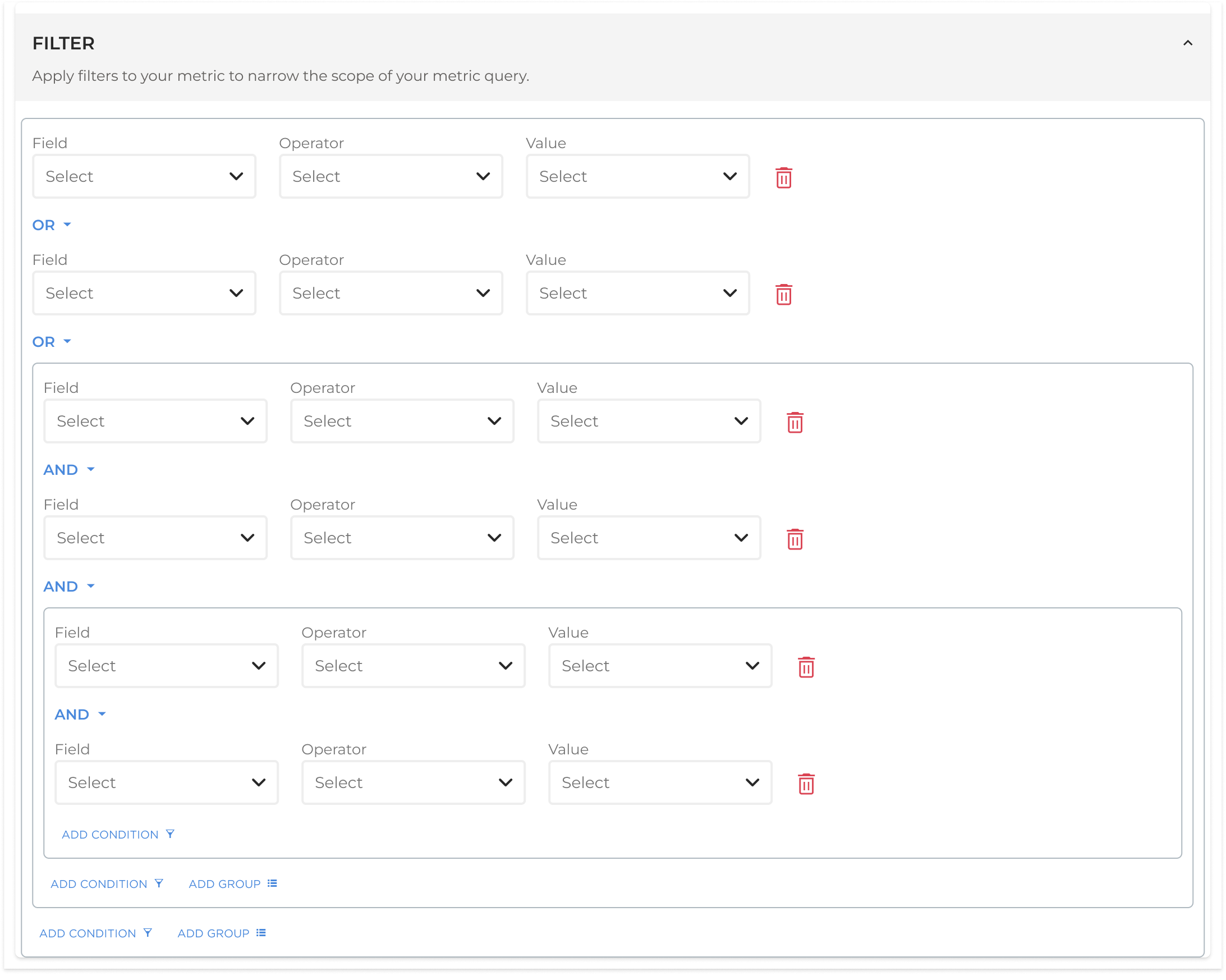
Pattern A — Boxed approach
Uses bordered containers to make filter groupings visually explicit. Clearer hierarchy, easier to scan at a glance — especially useful when multiple filters are applied together.
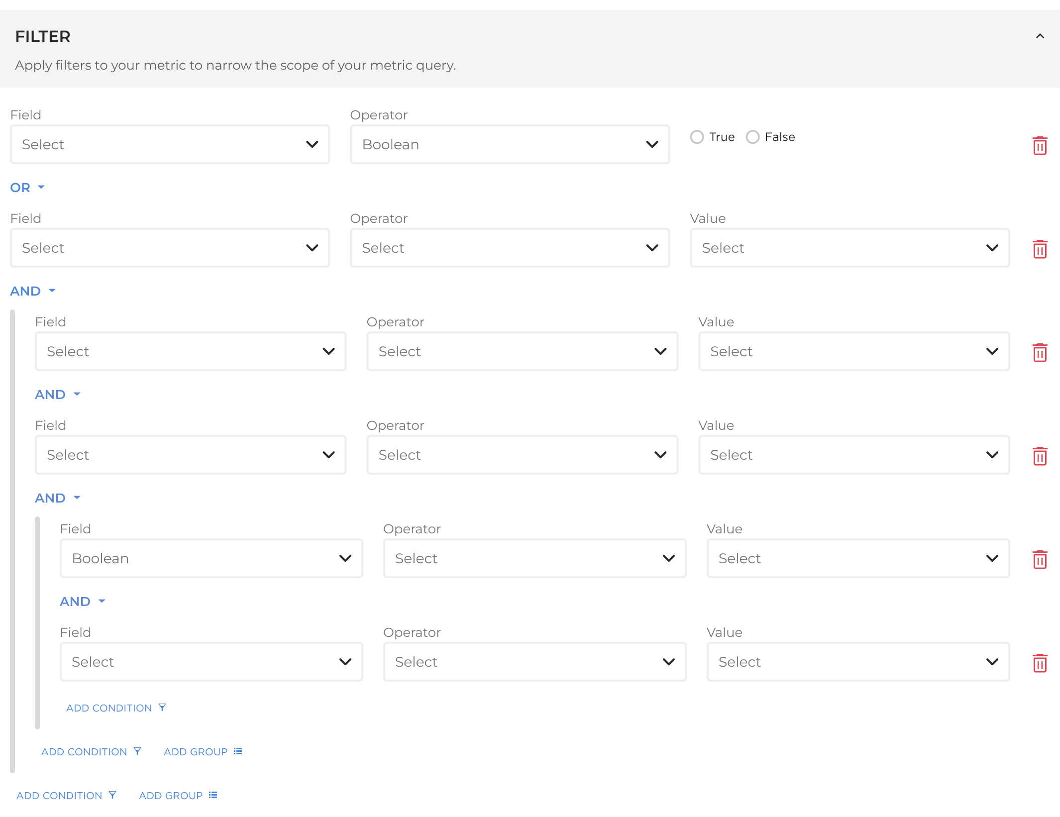
Pattern B — Lined approach
Uses vertical lines on the left to connect grouped filters. More compact and information-dense, but relies on users understanding the visual convention without explanation.
User testing broke the tie. An early-access customer rated the initial concept 7/10 — they loved the direction but got lost navigating between editable metrics. Their feedback sparked the key refinement: a slide-out drawer UI to spotlight the active metric and make the editing context unmistakeable.
Execution
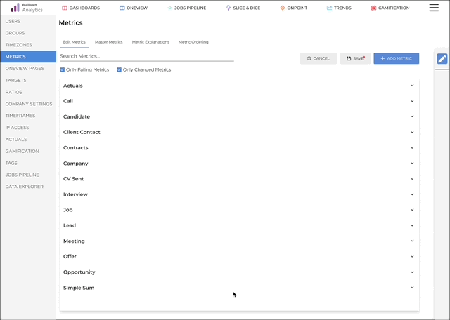
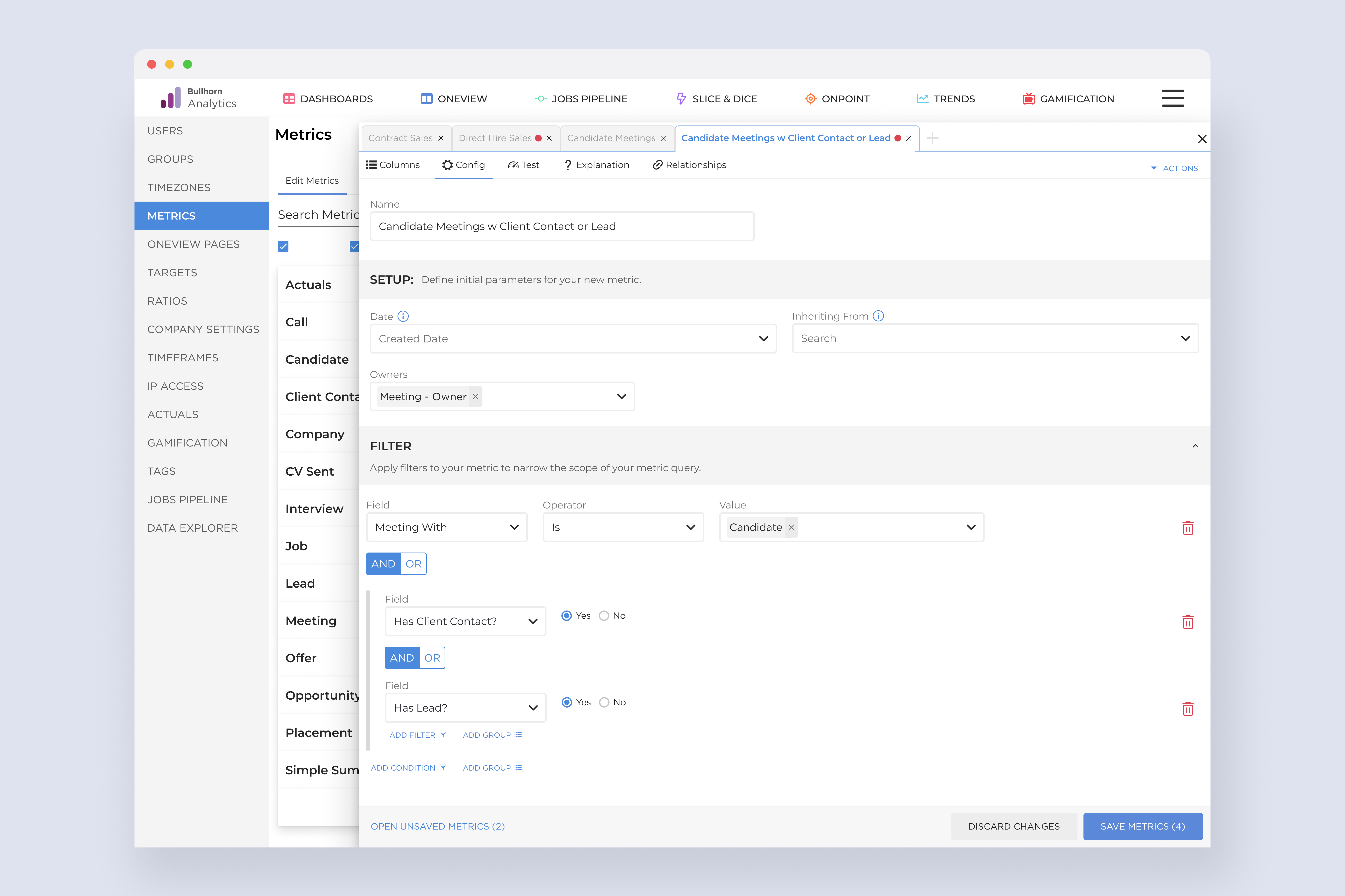
What this shows
A slide-out drawer that isolates one metric for editing — tabbed navigation lets you switch between active edits without losing context.
Why it matters
Early testing showed users getting lost when editing was inline. The drawer creates a clear, focused editing mode so users always know what they're changing.
The result
Unsaved edits across multiple metrics are accessible from a single drawer interface — reducing cognitive overhead and preventing accidental data loss.
Results
In the first two months after launch, users edited 10,000 metrics themselves. Each one a support ticket that never got filed. Workflows sped up, frustration dropped, and the internal teams who had been absorbing that load could finally focus elsewhere.
10k
Support tickets eliminated
In the first two months, users took ownership of metric customisation that previously required internal team intervention — every time.
Reflection
The biggest lesson from this project was how much a single round of early user testing can reshape a design. The 7/10 rating was honest feedback — and the user who gave it handed us exactly what we needed to move from "pretty good" to something that actually worked.
Phasing the delivery also proved its value. Rather than waiting until the full system was built, each phase shipped real capability. Users got value incrementally, and the team stayed focused without being overwhelmed by scope.
A quick prototype reveals more than endless planning. Real user struggles — in this case, getting lost while editing — sparked the drawer that made the whole experience click.