Designing a structured approval workflow so recruiters could fix pay rate errors without bottlenecking the payroll team.
The Problem
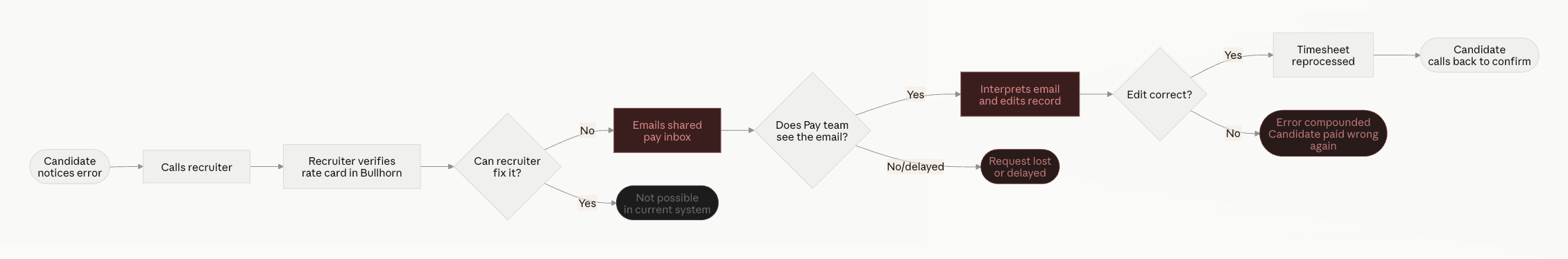
Recruiters at staffing agencies frequently needed to update pay rates on active placements — after a negotiation, a market adjustment, or simply a data entry mistake. But inside Bullhorn, there was no workflow for this. The only path was to email a shared pay team inbox and hope someone caught it. No tracking, no audit trail, no ETA.
"Users were routing around the product entirely — the fix lived in someone's inbox, not the system."
Payment Delays
Candidates faced financial stress when timesheets were processed at the wrong rate, eroding trust in the agency.
Manual Overload
Pay specialists spent hours triaging loosely-written emails and manually editing sensitive payroll data.
No Oversight
Rate changes happened with zero visibility — no history of what changed, when, or why.
Discovery
We ran a "Day in the Life" research initiative — shadowing 10+ payroll and billing customers end-to-end across their workday. We weren't looking for rate cards specifically. They surfaced on their own, repeatedly, as something everyone had quietly accepted as broken.
01
Every correction started with a phone call and ended with an email.
02
The shared inbox was a second job on top of their real one.
03
The internal distinction didn't match how they thought about the problem.
04
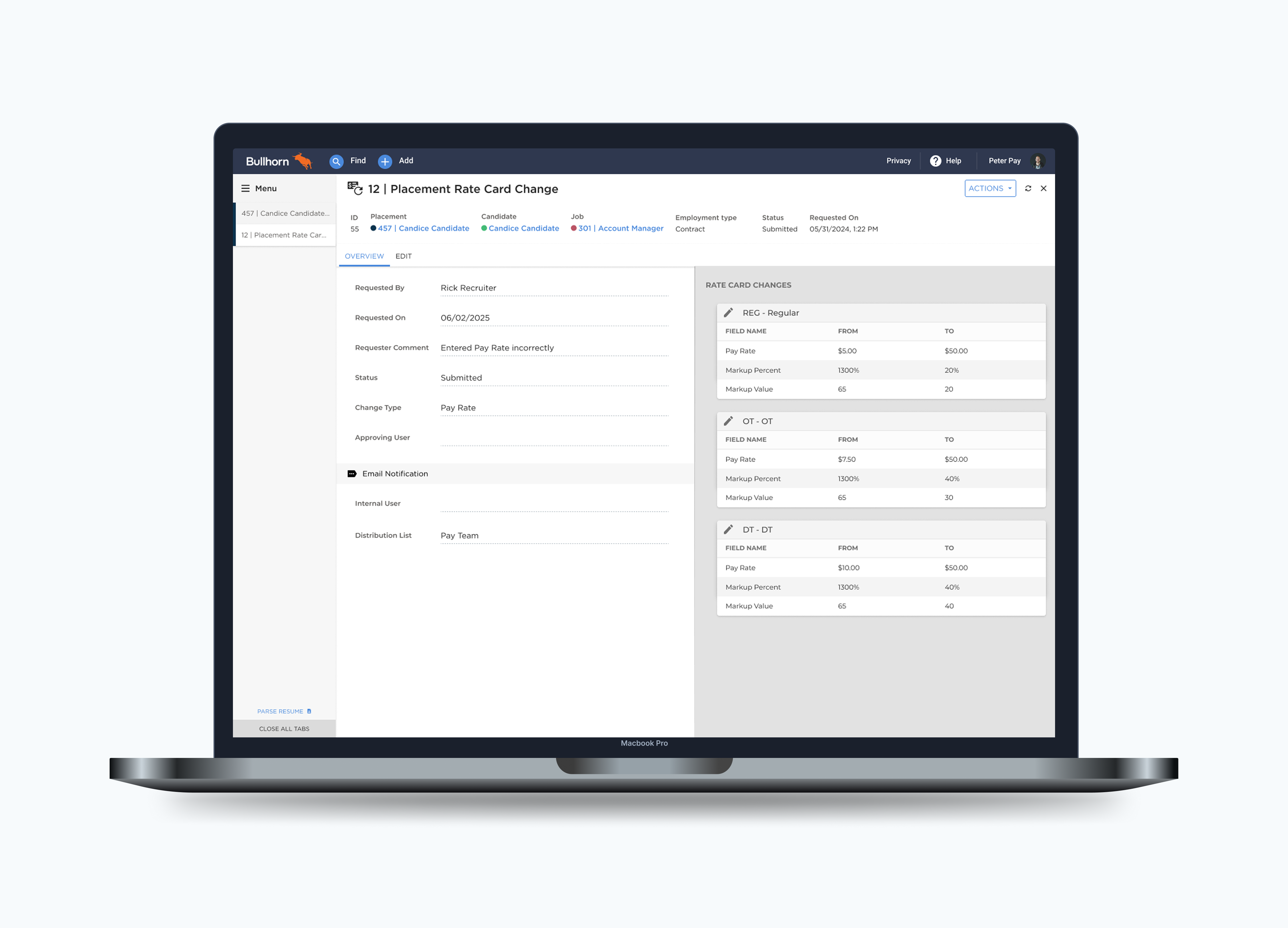
If someone edited the rate card before a request was approved, the request became invalid with no warning.
Design Decision
Early on, we designed around Bullhorn's internal concept of "new vs. existing" rate cards — effective-dated versions that let the system track pay rates over time. Testing revealed recruiters didn't understand or care about this distinction. They just wanted to correct the current rate. I pushed to remove that abstraction entirely and design around their mental model: submit what changed, see it approved or rejected, move on.
"Recruiters didn't care about effective dates. They just wanted to fix the pay rate — so we built around that."
Early Explorations
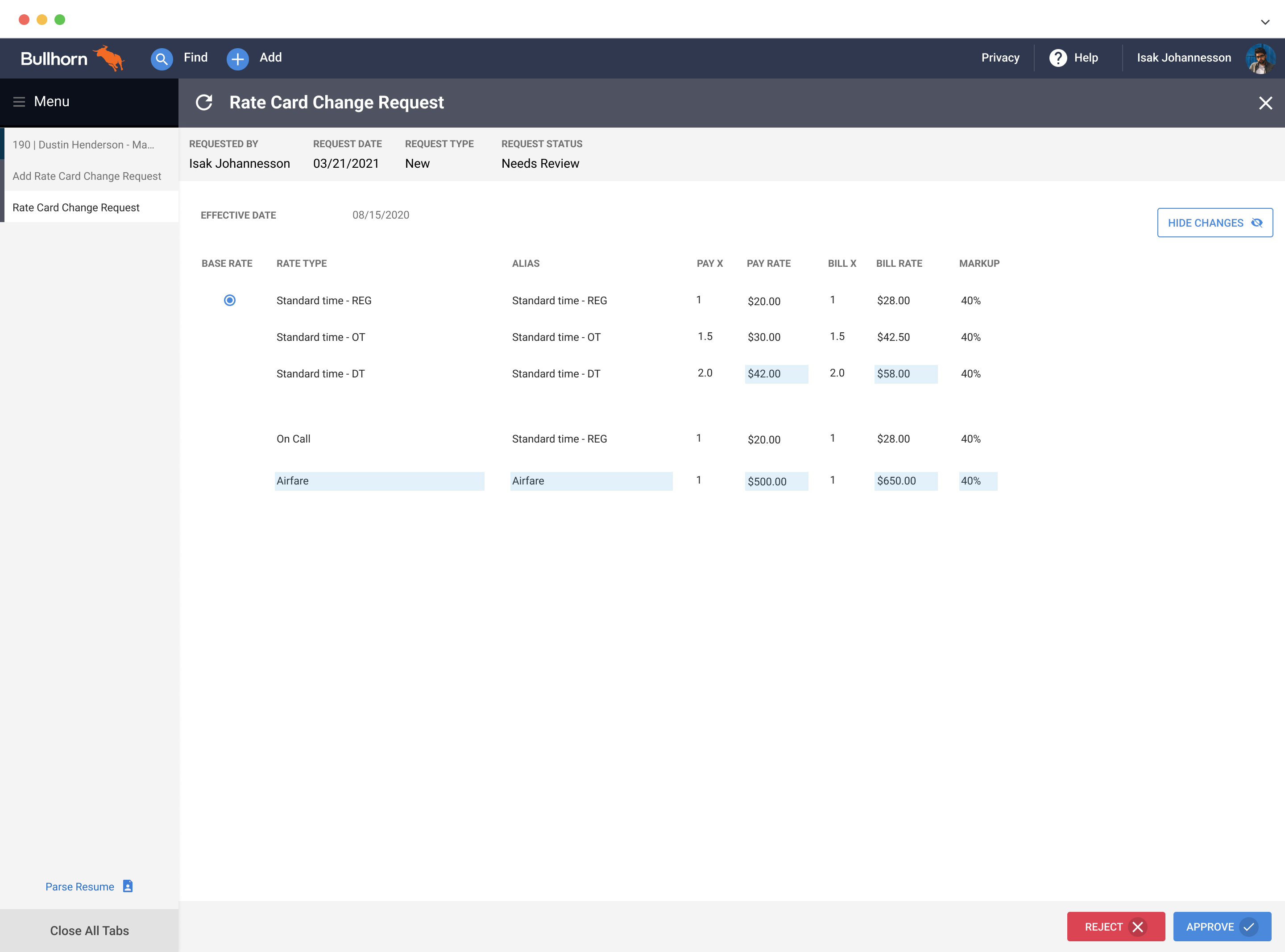
Our first concept showed the full rate card context alongside the change request, giving pay specialists confidence when approving. Usability testing showed this was too much — approvers wanted to focus only on what changed.
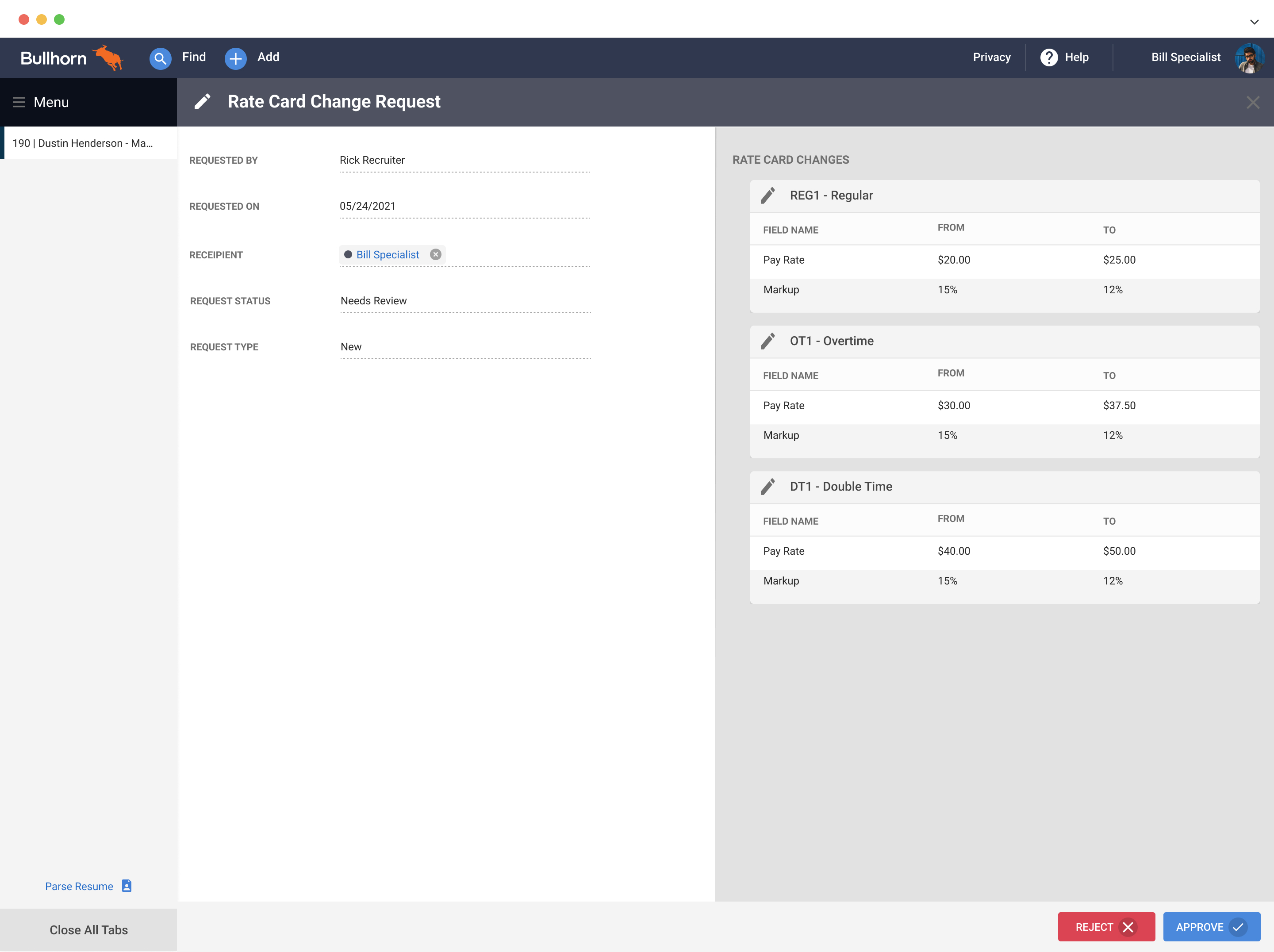
The second concept stripped it back to only the changed fields, displayed as a clear before/after. 5 of 7 usability participants preferred this immediately. It became the foundation for the final design.
Usability Testing
01
5 of 7 users preferred it. Seeing the delta clearly was faster than scanning a full rate card.
02
"Reject" felt too final. They wanted to make a small correction and approve in one move.
03
Users wanted status labels that matched their workflow: Return for Revision, Approved with Changes.
04
Approvers wanted to leave context when returning a request, not just a status change.
05
Recruiters didn't understand "New vs Existing" rate card terminology. Removed entirely.
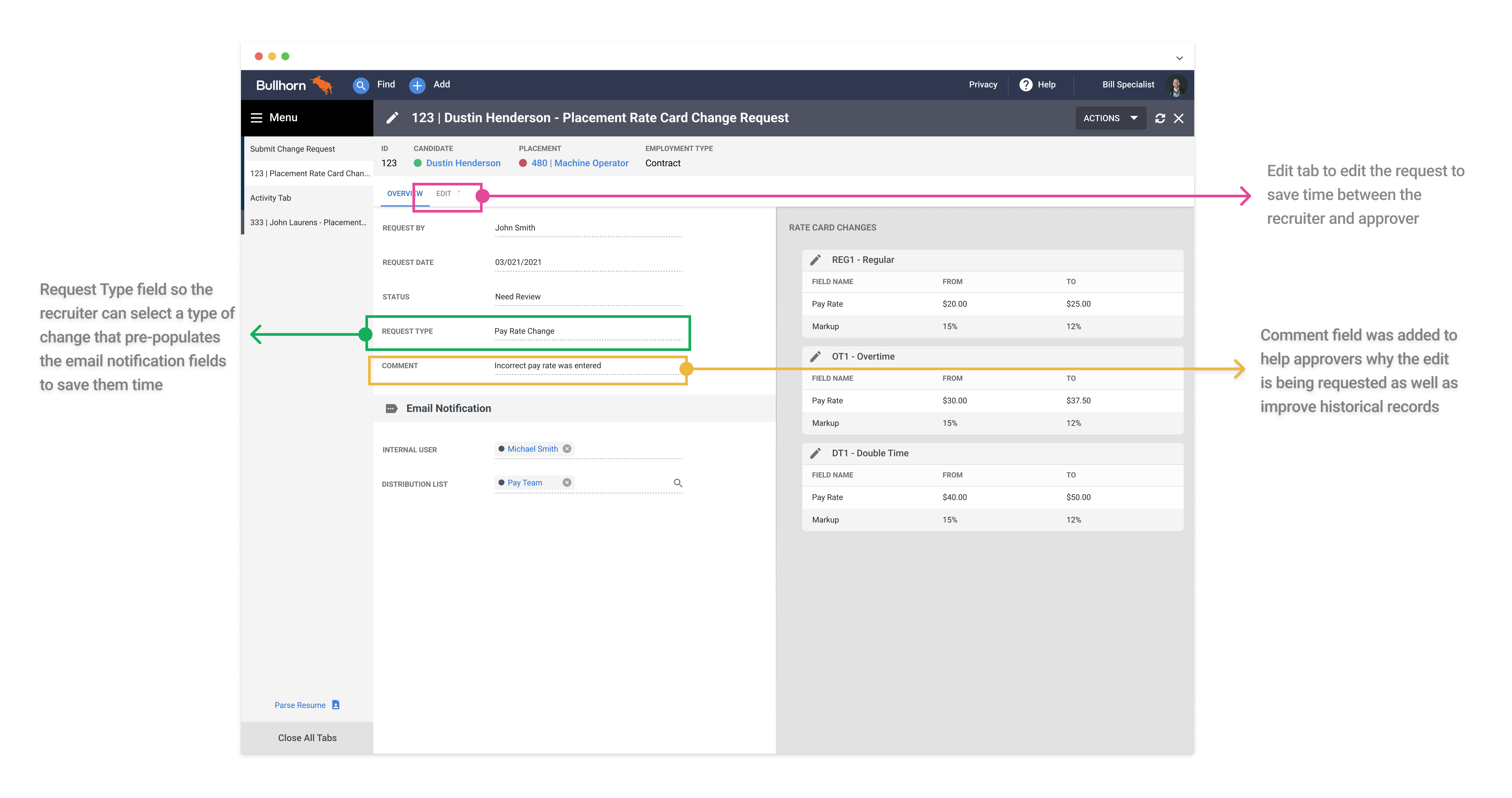
06
Adding a "Change Type" field let the system pre-populate the right approver, cutting routing mistakes.
Final Design
6,000+
Recruiters at Launch
Using the feature monthly from day one.
2
Interactions Required
Submit a request. Approve or return. Nothing else required.
The final experience gave recruiters a structured in-app path to submit rate corrections, and gave pay specialists a clear approval interface showing exactly what changed and why. Edge cases — like a change request conflicting with a future-dated rate card version — surfaced inline with clear guidance rather than silently failing.
Reflection
The hardest part of this project wasn't the UI — it was deciding what not to build. Effective-dated rate cards are genuinely complex, and there was pressure to expose that complexity to users "for accuracy." Usability testing gave us the data to push back: recruiters didn't need to understand the system's internals, they needed to fix a rate. Keeping the design simple required more engineering work, not less — and that's a trade-off worth making.
What I'd do differently: get pay specialist workflows mapped earlier. We spent time designing for the recruiter side first, then had to retrofit the approval experience. Starting with both sides simultaneously would have surfaced the "editable approval" insight much sooner.