Creating an Effective Way to Visualize Business Metrics
The new dashboard transforms how recruiters, managers, and agency owners interact with analytics, providing a centralized hub for quick, actionable insights.

UX Research
UX Design
Feb 2023
Product Manager, Architect, Product Owner, Lead Front End Engineer
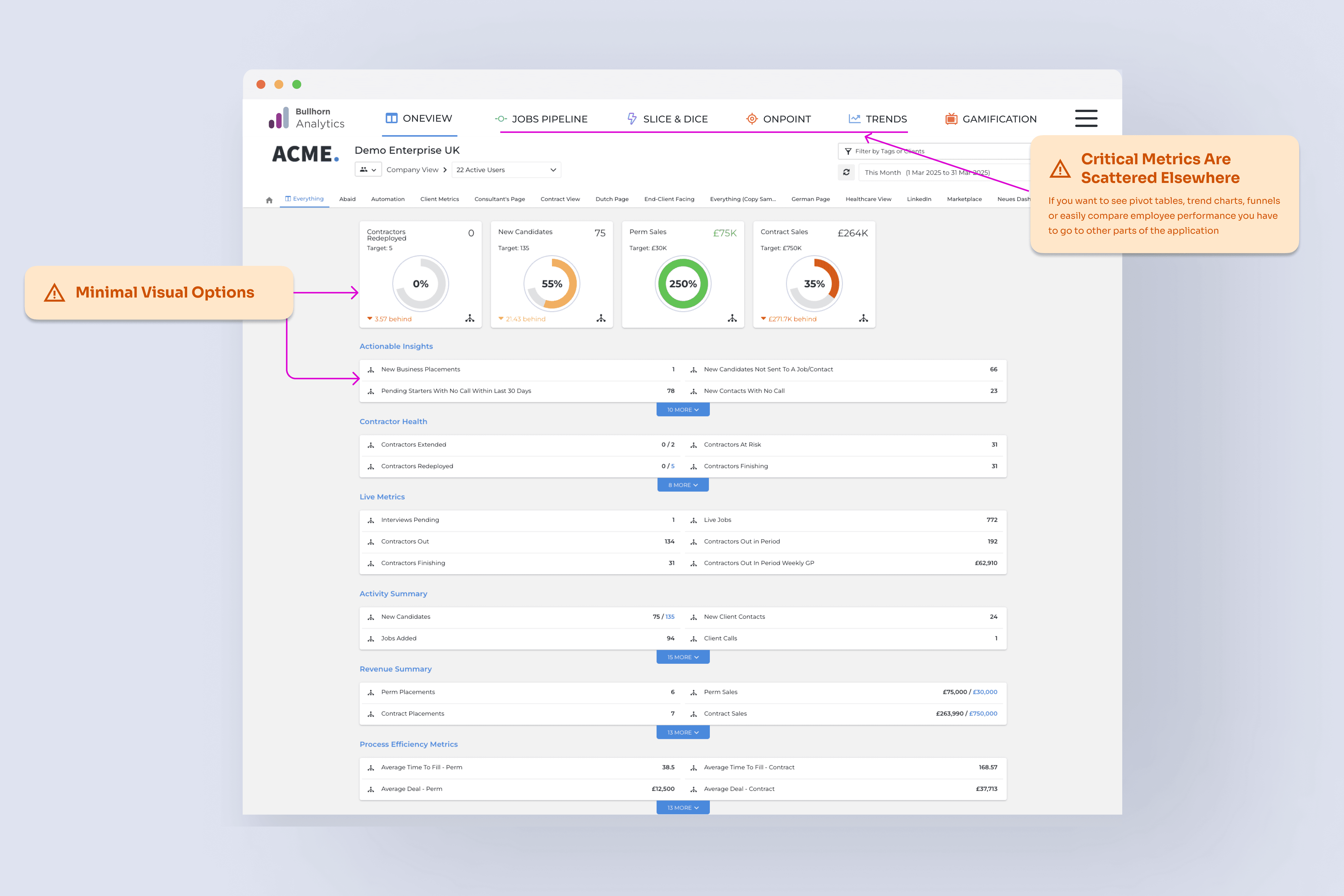
CHALLENGE
Users were frustrated by scattered data and complex customization, often resorting to external tools or IT support just to create reports.
The current Analytics product overwhelms recruiters, managers, and agency owners with scattered data across the product and a complex customization process. Users struggled to extract meaningful insights, often requiring external tools or technical expertise to configure reports.Our task was to consolidate the most used metrics and visuals on to one dashboard, simplify data presentation, and empower users to customize reports effortlessly—enhancing engagement and decision-making.
SOLUTION
A Data-Driven Dashboard That Works for Everyone.
Based on our research, we identified the most-used metrics and data visualizations scattered across the platform and consolidated them into a single, streamlined dashboard. This allowed recruiters to access key insights without switching between multiple reports. By improving customization, navigation, and data clarity, we created a dashboard that was both intuitive and powerful.
RESEARCH
Understanding User Struggles with Data Customization
We began by conducting interviews and analyzed usage data to understand pain points in navigating and customizing reports.
Managers struggled with a confusing report builder, leading many to abandon it in favor of spreadsheets.
Since 4/5 customers wanted employee comparisons, we prioritized a comparison feature on the dashboard.
4/5 hiring managers wanted a recruitment funnel visualization to quickly spot bottlenecks in the hiring process.
Users frequently mentioned that key business metrics were too difficult to find, leading us to surface them in the dashboard’s default view.
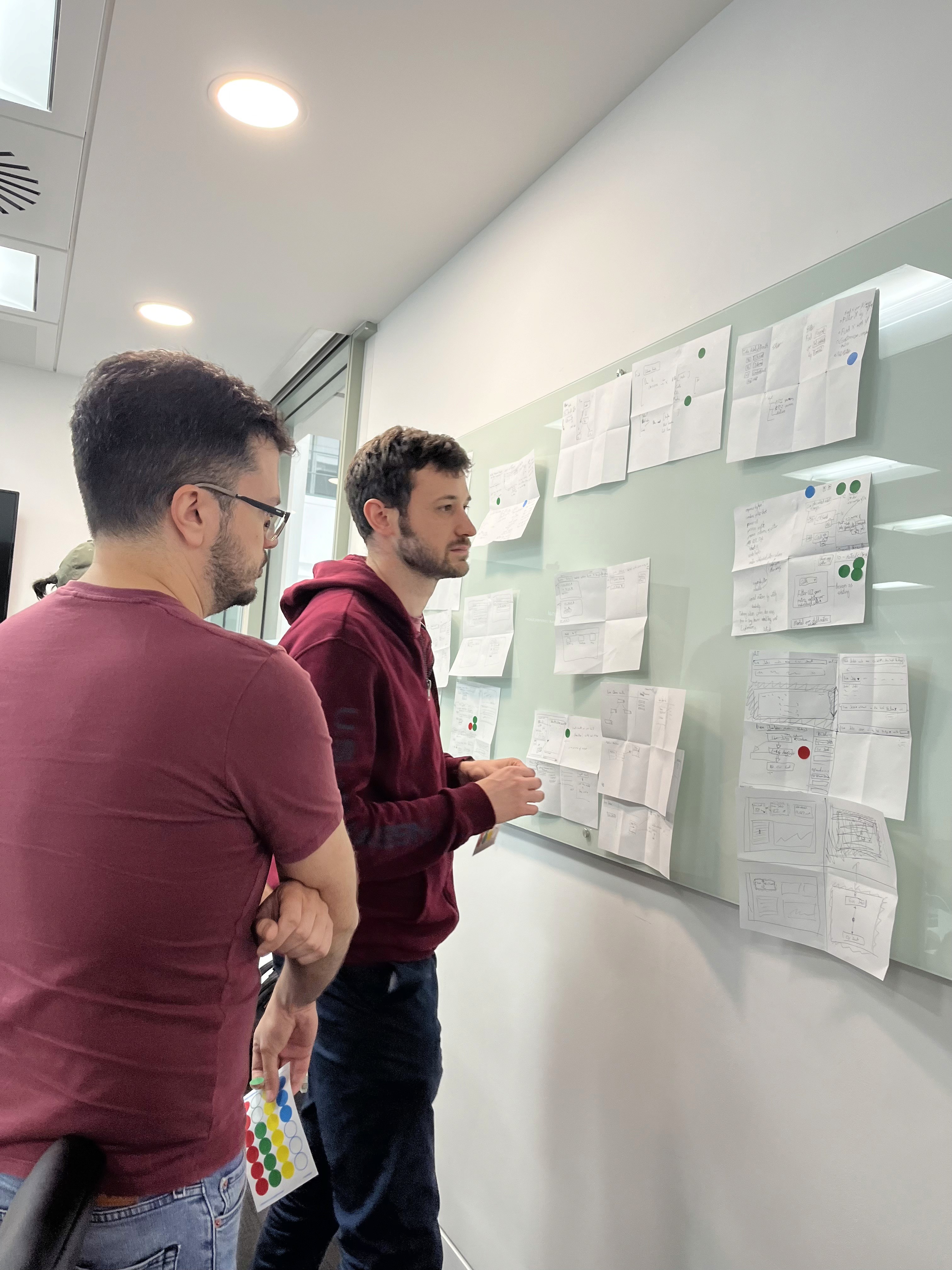
DESIGN
Navigating Crazy 8s: From Skepticism to Solutions
Our team kicked off a Crazy 8s exercise to explore ways to improve the dashboard experience, but initial skepticism challenged our approach. Through rapid ideation, user insights, and iterative design, we uncovered key pain points and developed a more intuitive, data-driven solution. The result was a streamlined dashboard that enhanced usability and drove measurable engagement.

USER TESTING
Validating the Design with Users
User testing was conducted with 8 customers to gather valuable feedback and validate our design decisions. The sessions were instrumental in aligning the final prototype with user needs. Overall, the feedback was positive, with only minor tweaks requested. Key findings included:
Managers requested the ability to share dashboards and set defaults for other users.
Users wanted more customizable color options and the ability to apply executive templates.
There were requests for additional functionality from other areas of the product to be integrated into the dashboard.
These insights will guide future iterations and ensure the dashboard continues to meet evolving user needs.
USER TESTING
Validating the Design with Users
User testing was conducted with 8 customers to gather valuable feedback and validate our design decisions. The sessions were instrumental in aligning the final prototype with user needs. Overall, the feedback was positive, with only minor tweaks requested. Key findings included: -Managers requested the ability to share dashboards and set defaults for other users. Users wanted more customizable color options and the ability to apply executive templates. There were requests for additional functionality from other areas of the product to be integrated into the dashboard. These insights will guide future iterations and ensure the dashboard continues to meet evolving user needs.
Simplifying Widget Creation with a Guided Wizard
Step-by-step guidance simplified adding widgets.
No technical skills are needed for customization.
Reduced learning curve and boosts user confidence.


Maximizing Dashboard Space Without Losing Functionality
Expandable sidebar balances clarity and flexibility.
A decluttered interface keeps key data accessible.
Optimized layout enhances focus and efficiency.
Simplifying Widget Creation with a Guided Wizard
Key visualizations now available directly on the dashboard.
Eliminates the need to switch between multiple reports.
Empowers users to analyze data faster and more effectively.
RESULTS
The New Go-To Hub for Analytics
User testing was conducted with 8 customers to gather valuable feedback and validate our design decisions. The sessions were instrumental in aligning the final prototype with user needs. Overall, the feedback was positive, with only minor tweaks requested. Key findings included: -Managers requested the ability to share dashboards and set defaults for other users. Users wanted more customizable color options and the ability to apply executive templates. There were requests for additional functionality from other areas of the product to be integrated into the dashboard. These insights will guide future iterations and ensure the dashboard continues to meet evolving user needs.
83%
Stickiness Rate
60%
Account Adoption
CONCLUSION
Adapting to Change and Delivering Impact
This project presented unique challenges, including the unexpected departure of key stakeholders mid-way through, which required me to realign the team and push for the resources I needed to move forward. It was a tough lesson in the realities of working in a large organization, where flexibility and adaptability are essential to success." Additionally, this was the first project where much of the scope was ultimately cut. While it’s disheartening to see large portions of your work not make it to production, I had to remind myself that the core goal was still being met—delivering a valuable solution to our users sooner. This experience taught me the importance of staying focused on the bigger picture and finding satisfaction in the progress made, even when the journey isn’t exactly what you anticipated